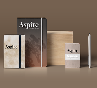
Building a brand
Stephanie, a licensed mental health professional, recently started her very own mental health practice. Aiming to reach a broader audience and establish a strong, trustworthy presence, she recognized the need for effective branding.
Together, we worked on creating a brand that conveyed compassion, professionalism, and a welcoming atmosphere, ensuring that her practice stood out and resonated with potential clients seeking mental health support.


Brand logo
Stephanie sought a logo that would stand out through its simplicity and elegance, opting for a type-based design without any accompanying symbols or intricate designs. Her vision was for a timeless logo that could endure the test of time while still feeling modern and relevant in today's design landscape. By choosing classic typography with a contemporary twist, Stephanie's logo captures the essence of her brand—both enduring and current, minimalistic yet impactful.
Version 1
Final Version
Color palette
When coming up with Aspire's color scheme I wanted to have colors that evoked feelings of warmth, stability, and comfort. Brown and neutral was the only way to go! They create a calming and welcoming atmosphere, which is essential for clients seeking a safe space for their mental health needs. Additionally, these earthy tones are often associated with grounding and naturalness, promoting a sense of trust and reliability in the services provided.
Cozy Mocha
#804B32
Iced Latte
#C5AA8C
Sipping Coldfoam
#ECE5E1
Wafer Cookie
#D8C0b8
Small Cappuccino
#F7D5BF
Favorite Booth
#100F0F
Custom website
Though not particularly tech-savvy, Stephanie had a keen eye for trendy, user-friendly websites. She envisioned a website that would be straightforward to navigate, preferring a one-page layout that could seamlessly present all the essential information about her mental health practice. This design choice not only simplifies the user experience but also ensures that visitors can quickly find what they need without getting lost in multiple pages.