Brands / Arbor Grooves
Building a brand
Sean and Jake were starting a sound paneling business, aiming to provide high-quality solutions for various spaces and clients. Recognizing that many businesses in this industry tend to be bland and cookie-cutter, they wanted to create a brand that stood out with a retro yet modern feel.
Together, we developed a brand that conveyed innovation, expertise, and reliability while incorporating a distinctive retro-modern aesthetic. This ensured their business not only stood out but also resonated with potential clients looking for top-notch, stylish sound paneling solutions.


Client's sketch

The logo
The team at Arbor Grooves noted that many competitors in their industry have bland and generic branding. They wanted to prioritize typography and make it the main focus of their logo design. The font they desired should strike a balance between a subtle retro vibe and high readability, making it easily identifiable. They were in search of a design that captured the essence of retro-modern aesthetics while maintaining a contemporary feel.
Final design
Color palette
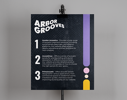
Sean and Jake's only request was for purple to be incorporated. I agreed that purple would work and would give that retro charm with modern sophistication. After multiple renditions, we landed on a color I called "Purple Opulence" to be the stand-out star. Purple, historically linked to creativity and luxury, perfectly captures the nostalgic aspect of their brand. I selected that unique shade of purple and paired it with pink, peach, and orange for a contemporary edge, ensuring the design was both striking and versatile. The palette beautifully reflected the innovative nature of their sound panels.
Purple Opulence
#6355A3
Lilac Chiffon
#DF9fC6
Tangerine Twist
#FAAB18
Final Onyx
#121820
Soft Peach
#F7D5BF
Bright White
#FFFFFF